If you have data and just put it out there it can be hard to visualize for instance a table of dates and columns of numbers doesn’t jump right off the screen and tell you anything about the data – is it changing in a steady way, are the numbers rising, falling or plateauing?.
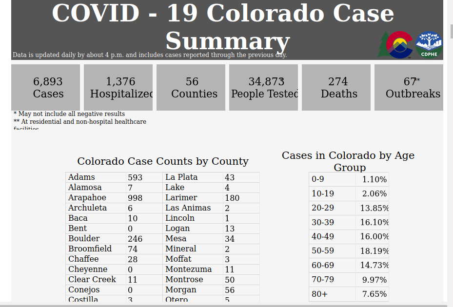
What does that tell me? not much really!
So you could do a Scatter graph – put dates across the bottom and number of cases up the side and put mark for number of cases for each date.

What does this tell me looks like a shotgun blast. Stuff across the bottom, stuff on top and in the middle.
Okay draw a line dot to dot.

Doesn’t help me much. Can’t we smooth it out?

By averaging the data over a few days the days of no or few cases followed by days of lots of cases you can visualize that cases have risen to a peak, but not really as high as the highest day and not as low as the lowest days. This is a lot better.It also compensates for times when some or all counties just don’t have time or ability or ??? to submit their counts and just report two days at a time, in situations like this graphing weekly cases would show the trend better, but you’d need to wait a week for a new picture.
Okay, how does this apply to scaremongering? Well presenting as a table of numbers all the reader will see is the number and it wouldn’t be reported on if it weren’t scary would it?
Or present it as a scatter or Bar graph like this:

That is scary, looks like things are exploding up. compared to the Trend line of the same data:

Or instead of showing the data as new cases daily, show how many cases there have bee since the start, adding each days new cases to the total:
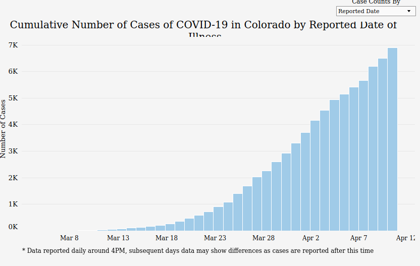
Same data but boy that looks scary, just keeps going up no end in sight! And look at those bigger numbers, those are thousands, the other was hundreds!
So how else can you make things scary? Here is some national data on deaths, first just Covid and pneumonia deaths:
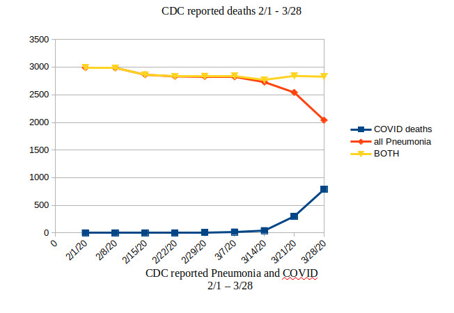
First ignore the red and yellow lines, just look at the Blue – COVID deaths nationwide weekly. Fairly sharp incline. Scary.
now also look at the red line for pneumonia cases. Its going down about as fast as the blue line. These two together make me wonder. There is also the yellow line which is Covid + pneumonia. More questions – are pneumonia cases going down because people are washing hand, staying away from nursing homes? Or